
Redesigning the mobile experience
The Inspectorio platform is a B2B solution that provides a single centralized source of truth for all key stakeholders in the production process.
The mobile and web apps allow users to execute, monitor and report on quality control activities during the Inspection process. Through the app, all inspection data is collected on-site allowing users to create reports in seconds.
The company vision is to create an industry-standard application with a high degree of customization and adaptable to different inspection workflows depending on the needs of different customers. Therefore, the mobile platform required a redesign to support new features and improve the user experience.
The Problem
This mobile app already set the first step to digitize and automate manual inspection processes in many production chains.
However, some issues have been detected which are impacting the time needed to complete complex inspection workflows causing bottle-necks in their daily work.
The mobile app performance is not ideal, users have reported difficulties understanding the information architecture as It’s hard to understand the information hierarchy and how to interact with certain elements.
Also, the nature of the work requires displaying multiple pieces of content is displayed on small mobile screens.
Rigid navigation
Hard to move between different steps in the process or between the main options once an assignment is started.
Confusion
The current solution is not matching the user’s mental model.
Manual input
Even though the process is digitized, it still required a lot of manual work impacting the individual performance.
Difficult to use
Hard to understand how to use certain functionalities and why they work in a specific way.

The Challenge
The app is used during QA inspections in production factories where sometimes the network and connection conditions are not ideal.
Not all users are tech-savvy, therefore, the app solutions need to be more visual highlighting elements that allow inspectors to input information efficiently.
During the inspection process, users are focused on multiple activities plus interacting with the mobile app.
Also, each inspection workflow has multiple steps requiring different types of interactions which in the previous version are not ideal.
Our Target
The mobile app should be a tool that inspectors can leverage to ensure that inconsistencies are properly reported but also to be one step ahead in the prevention of defects.
The Process
As the scope of the project was to revamp the application from scratch to improve the user experience and provide better interactions to complete the users’ objectives easily.
The first step to solve the challenge was to perform an internal audit of the current version and determine flows or modules not working properly.
Later, the product backlog for the mobile app was reviewed to define potential enhancements that must be included in this project.
Another key aspect was understanding how inspectors are using the app in a real context and learning from their experiences in the field. Therefore, we join them in the factories to experience the pain points, bottlenecks, and problems that prevent the app to deliver a good experience.
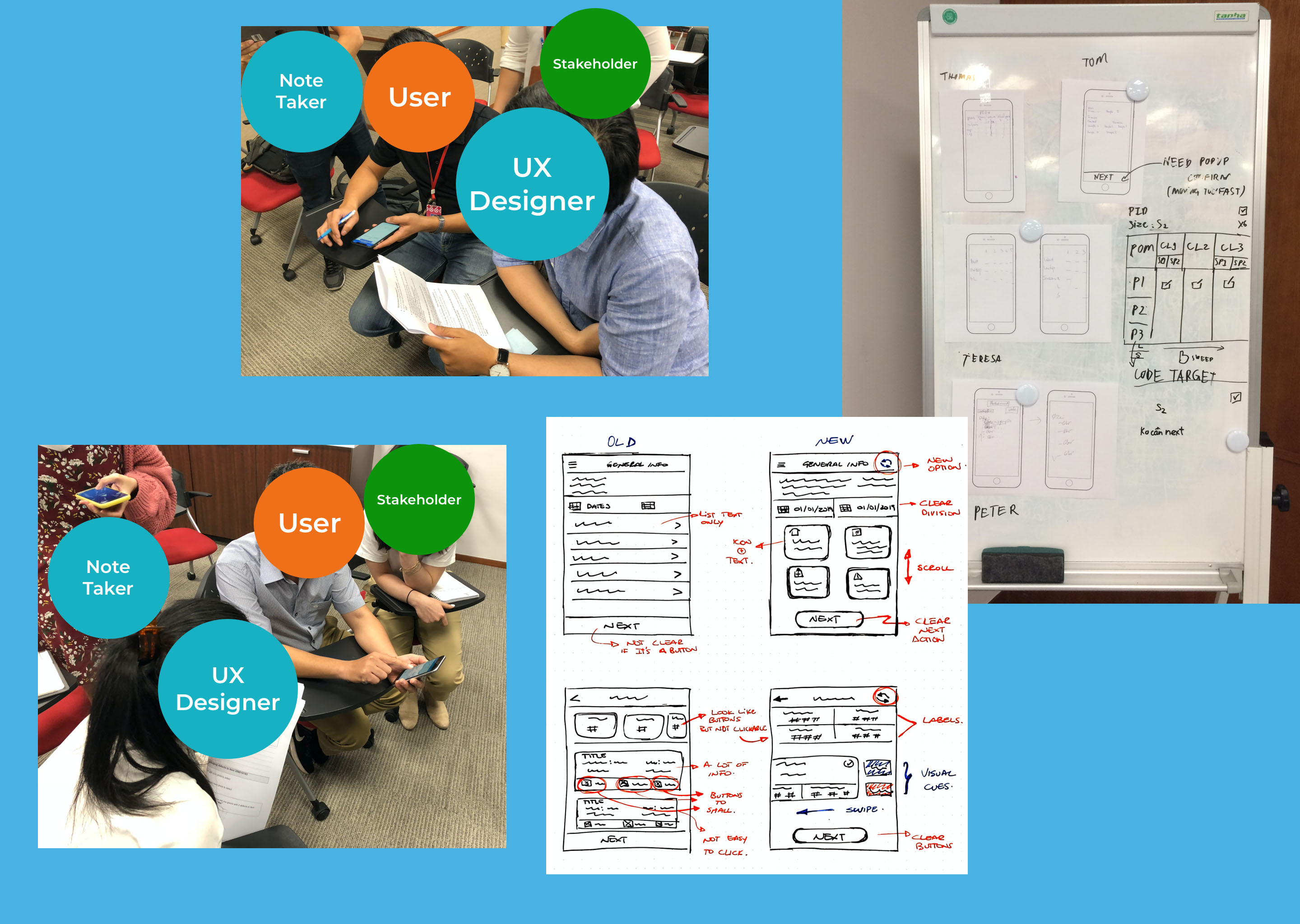
Audit
Review the current module looking for problems and potential enhancements.
User interviews and regional workshops
Engage with the real users to understand their current situation, pains, gains, and feelings while interacting with the app.
Define pain points and improvement opportunities
Map out the key points where changes are needed and also discover the reasons for bottle-necks.
Collaborative brainstorm
Brainstorm different options and ideas to improve the navigation and main modules with the goal of simplifying the process and generating a better experience.
Exploration
Try out and generate ideas to create the potential solution considering both the users’ and the business needs.
Validation and Evaluation
Validate the different proposals with end-users using low fidelity and high fidelity prototypes to determine and prioritize features on the final solution.
Multiple research iterations and feedback sessions
5000
15
7
The Solution
The main concept behind the design proposal was to increase the productivity of people and ensure that they complete all the inspection steps in a clear and efficient way.
The goal was to leverage on better interaction elements that can help people to navigate and complete information faster. Focus on potential enhancements that can improve the app performance as well as simplify the human effort required to complete the workflow’s steps.
We focused on creating an experience-centric design, keeping the users’ needs in our minds all the time.
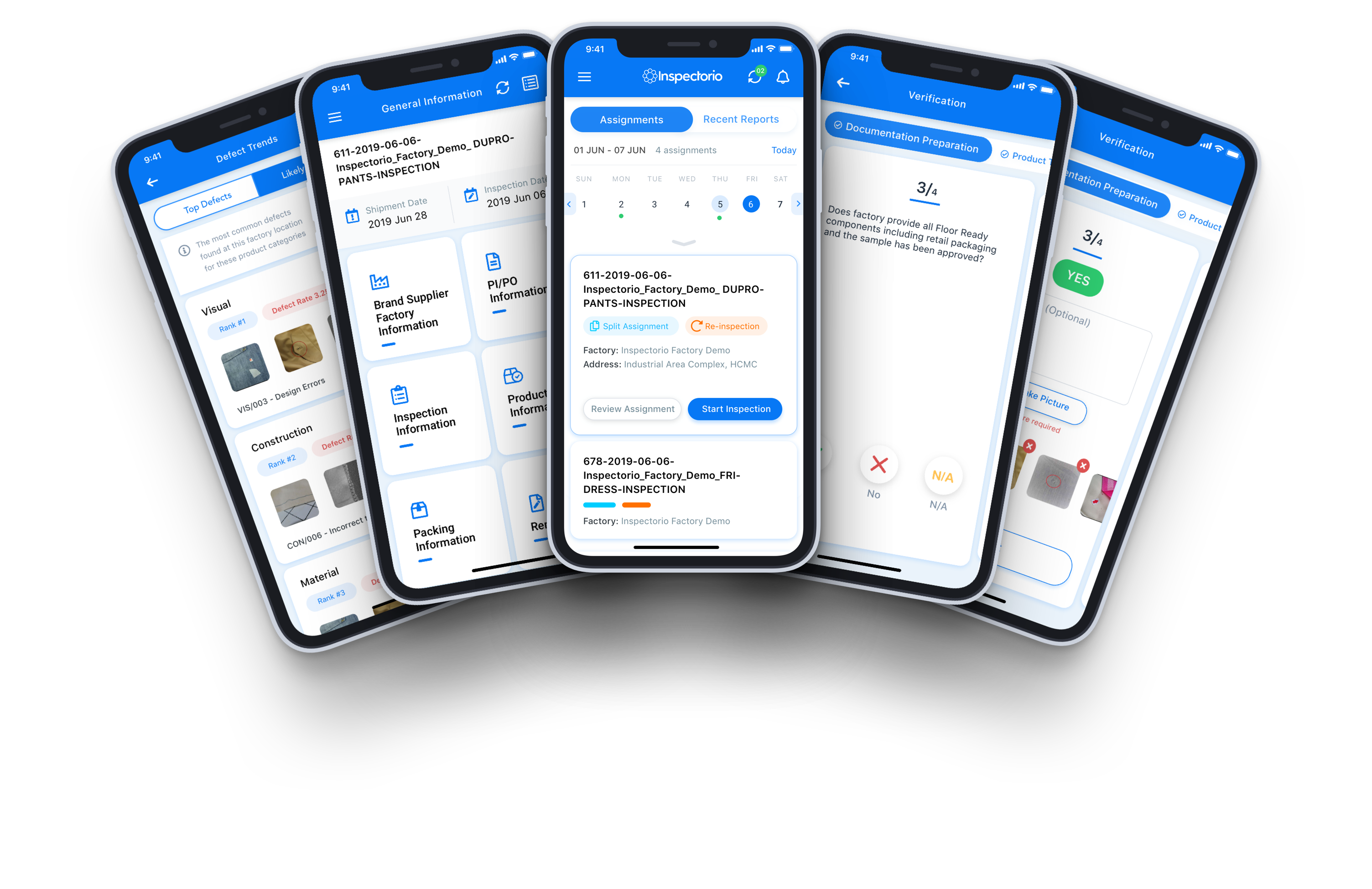
Easy to use
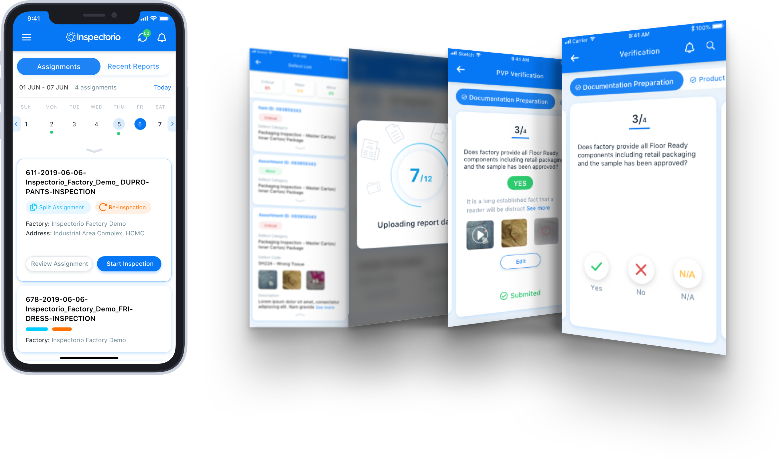
Simplified navigation leveraging on actions and gestures the users are already familiar with.
Relevant platform feedback
Push Notifications and in-app feedback to offer guidance throughout the inspection flow
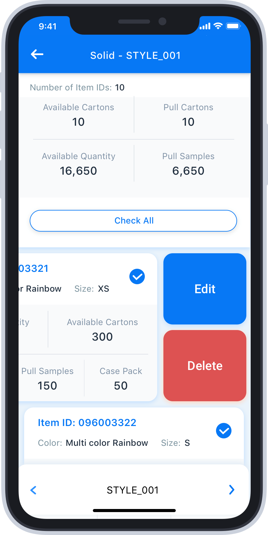
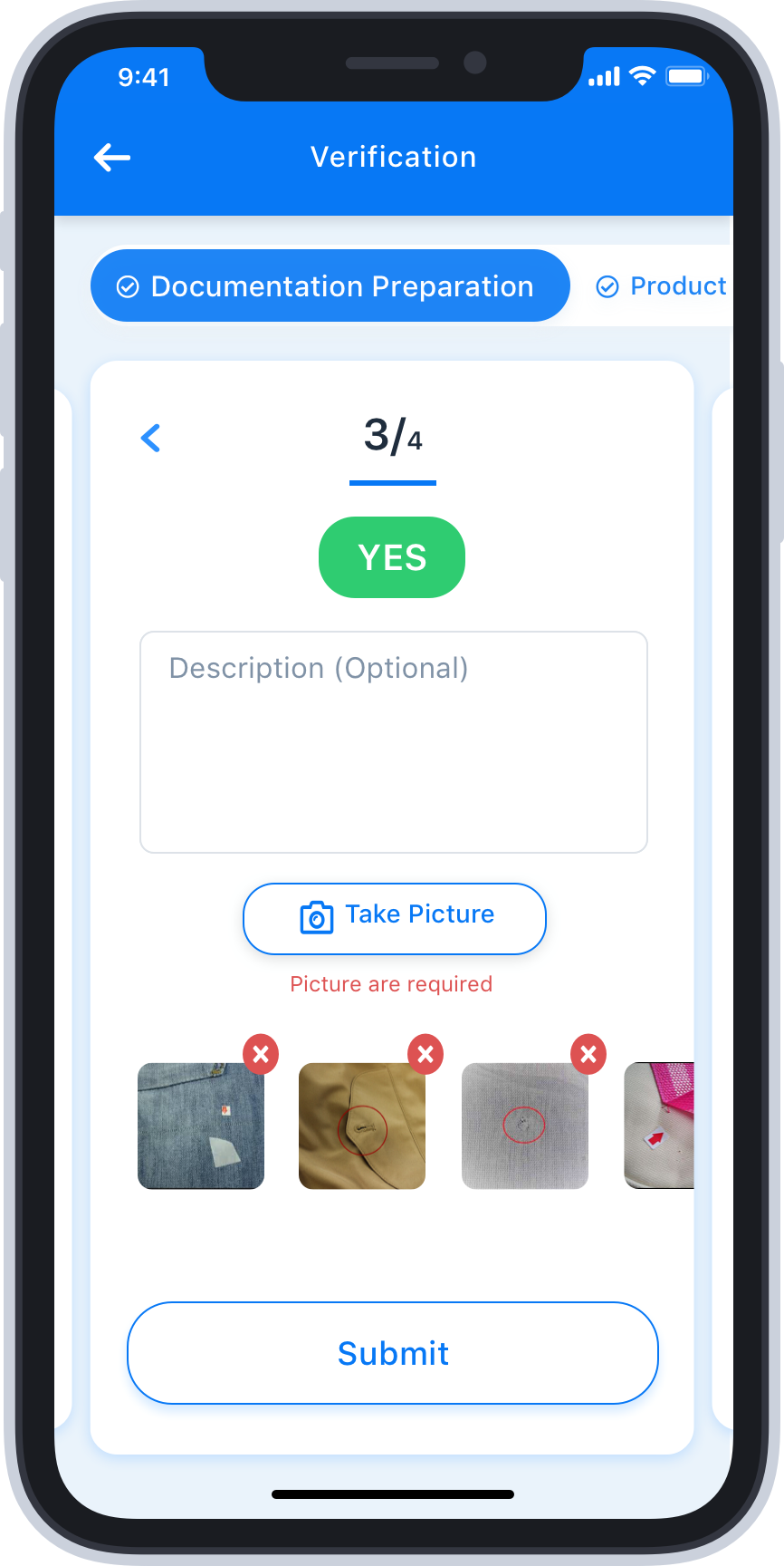
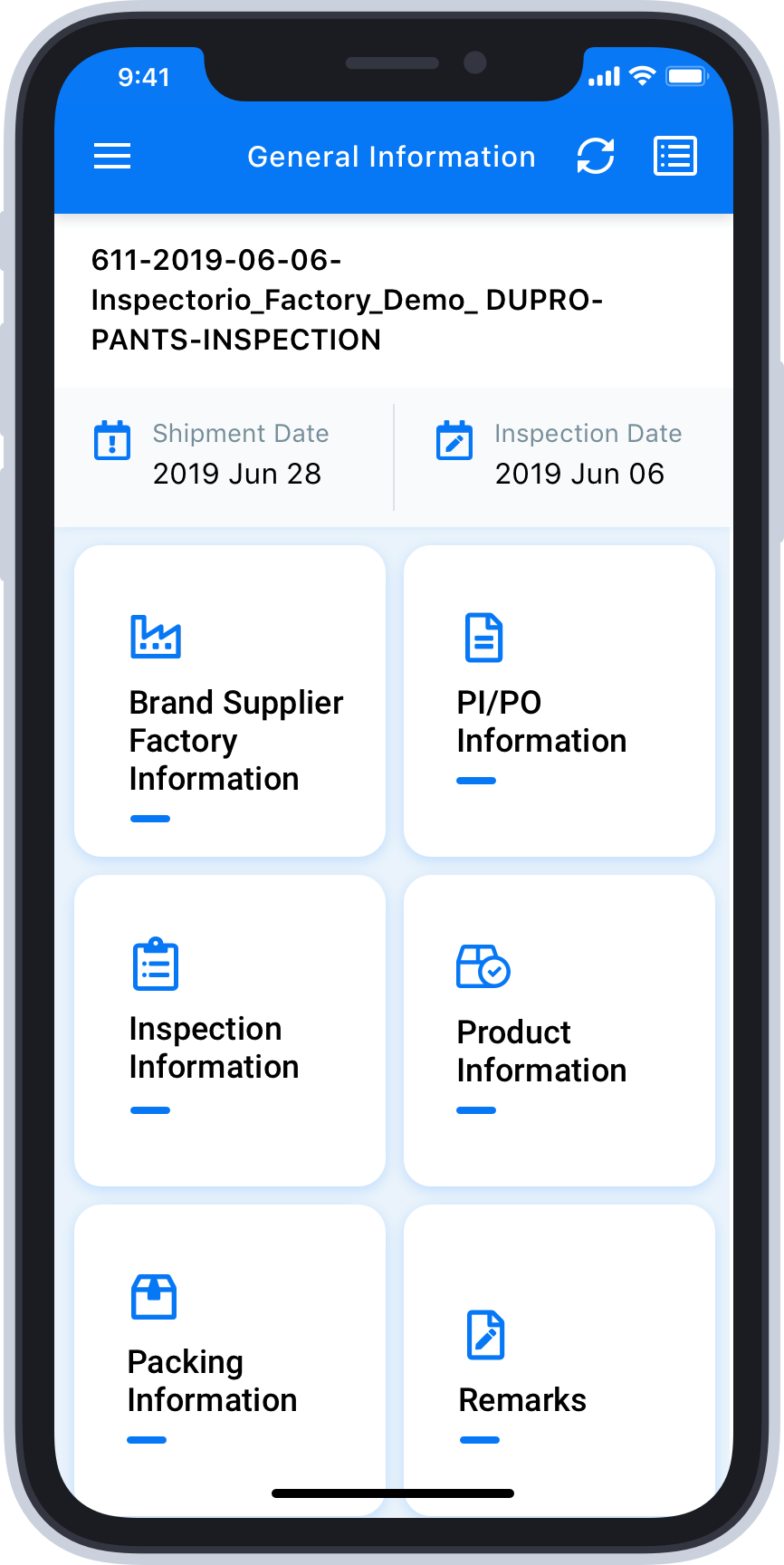
Revamped Inspection Components
The enhanced functionality of key inspection components as measurements or defects recording.
Actionable Data
One-touch interaction for inspection data. Share reports and findings from the palm of your hand.
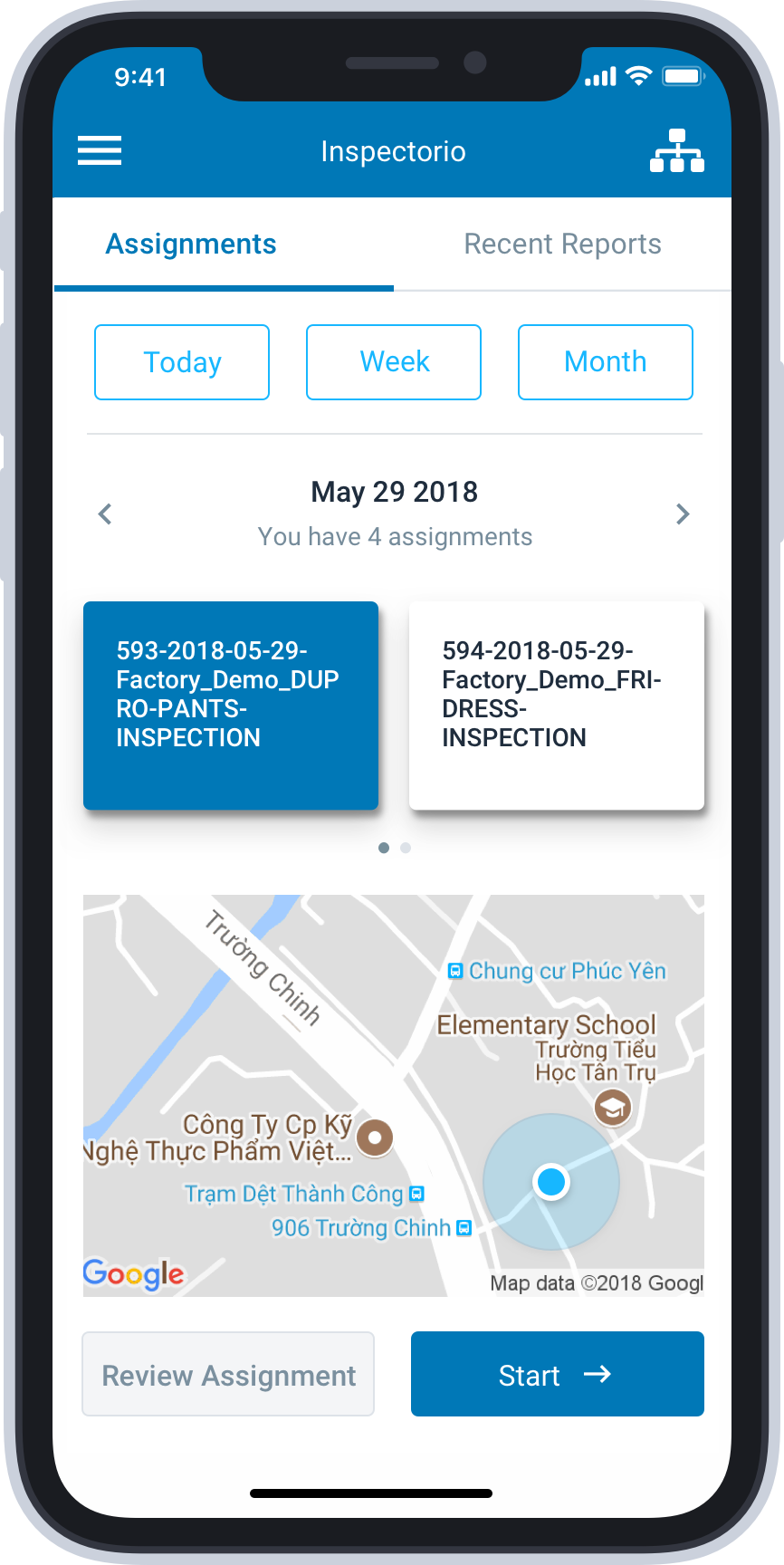
Before
Difficult to interact with some features; some functionalities are not so relevant in specific contexts.
Missing key information when reviewing inspections.
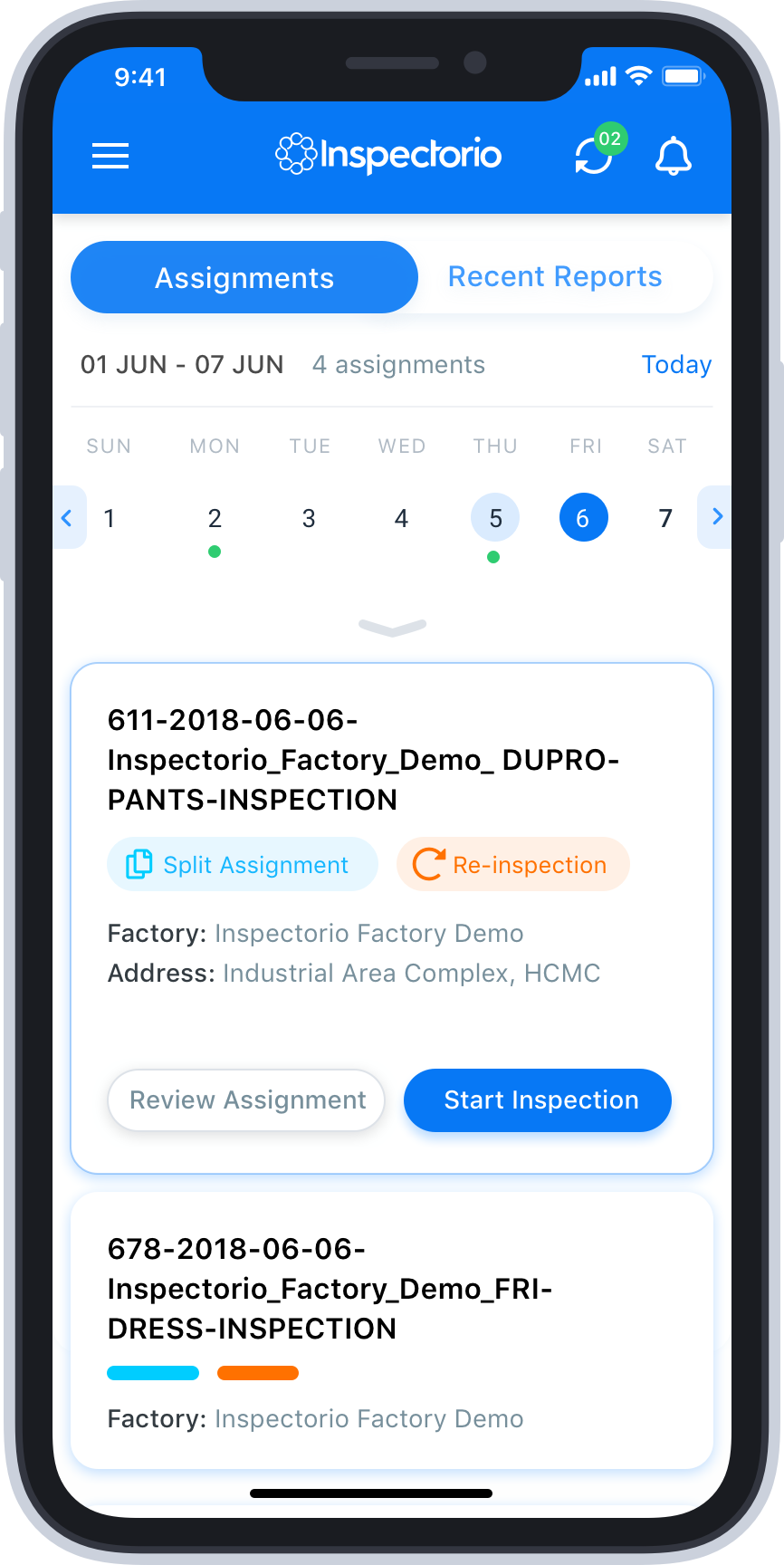
After
Based on feedback, the new version prioritizes access to relevant information at all times.
My role in the project
Design Team Lead, Product Designer, Mentor
Design Strategy
Define the design strategy and support ideation sessions
Project Definition
Determine and define personas, use cases, and user journeys
Define the user flows and interactions between the app modules

User Research
Conduct interviews with users to gather qualitative information
UX Deliverables
Mockups and interactive prototypes with finalized UI design
Usability Testing
Conduct usability testing sessions
Gather feedback from the users
Process Feedback and Insights
Pivot ideas based on user feedback and testing results
Gather insights for enhancements
Disclaimer: Due to NDAs and contractual obligations, some details of the project have been anonymized
