Revamp a POS system being used by convenience stores to perform different transactions for services by simplifying the selling process. Provide insights and custom reports about business performance.

Transforming the Point Of Sale experience for small businesses
Overview
The Problem
The selling process at the moment has multiple steps and takes time. It’s not easier to look for a specific product and also it’s too manual as the user needs to input the product detail and value.
The current system also lacks flexibility in the reports module. There are certain fixed reports that don’t fulfill the needs of the supervisors and managers as they cannot be dynamically generated.
Confusion
When the user is a seller and an admin, it is very hard to distinguish between the 2 profiles. Users have trouble finding the right modules.
Lack of Business Insights
The system is not providing enough business visibility.
Some sales information is not displayed anywhere or not easily available.
Complex Sales Module
The main task is to sell products. However, the current selling module is not flexible enough to allow quick product searching making it difficult to complete the transactions.
Bad User Experience
The current system lacks flexibility, it is complex to navigate and use.
The Challenge
Not all users are tech-savvy, therefore, the solutions need to be more visual highlighting the searching options that allow cashiers to find the products quicker and perform a sale; or allow the managers and admins to perform customized and filtered reports that adapt to their specific needs.
Improve the process to manage information about stores, products, and sales. Provide a way to effectively track the daily activities as well as consolidated weekly, monthly, and quarterly information.
The Process
To solve the challenge, a key thing was to understand and assess the user’s needs and understand their pain points. It was crucial to perform a Field Research Study that allowed experience first hand how users are interacting with the product.
As a UX designer, it was important to determine the roles that the different actors involved in the system usage (cashiers, store managers, business owners), and define what is the most useful information according to their context.
Iteration rounds allowed us to refine the different ideas and proposals that the team crafted. Performing user testing sessions was key to determine and prioritize which features to include in the final solution.
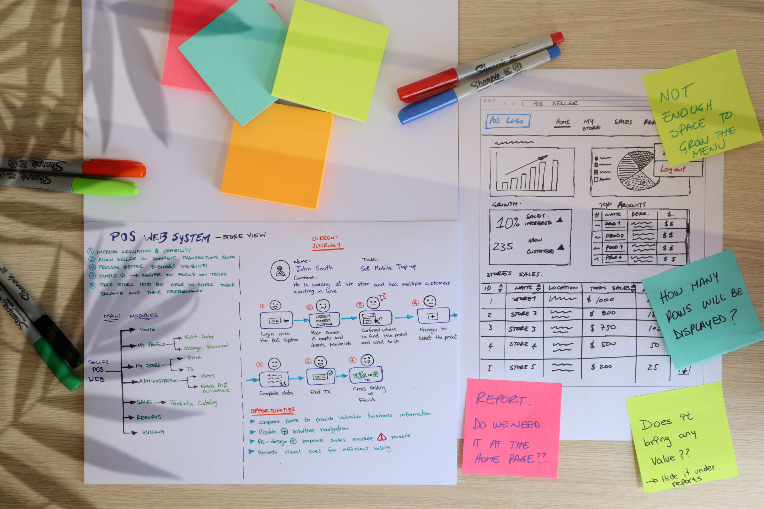
Field Research
Used to understand the main needs and pain points based on the users’ daily interactions.
Determine the right roles
Analyze the usage and the system and what are the different needs of users based on their tasks and requests. Define what information needed to be available depending on their working role.
Understand the main tasks
Comprehend what are the main tasks that the users should focus on depending on their role. Get a clear idea about what is the most useful module and where are potential problems.
Exploration
Brainstorm different options and ideas to improve the navigation and main modules.
Evaluation and Testing
Validate the different proposals with end-users using low fidelity and high fidelity prototypes to determine and prioritize features on the final solution.
Iteration
Based on feedback, refine the ideas and hypothesis that had a good impact on the end-users to provide a solid final solution.
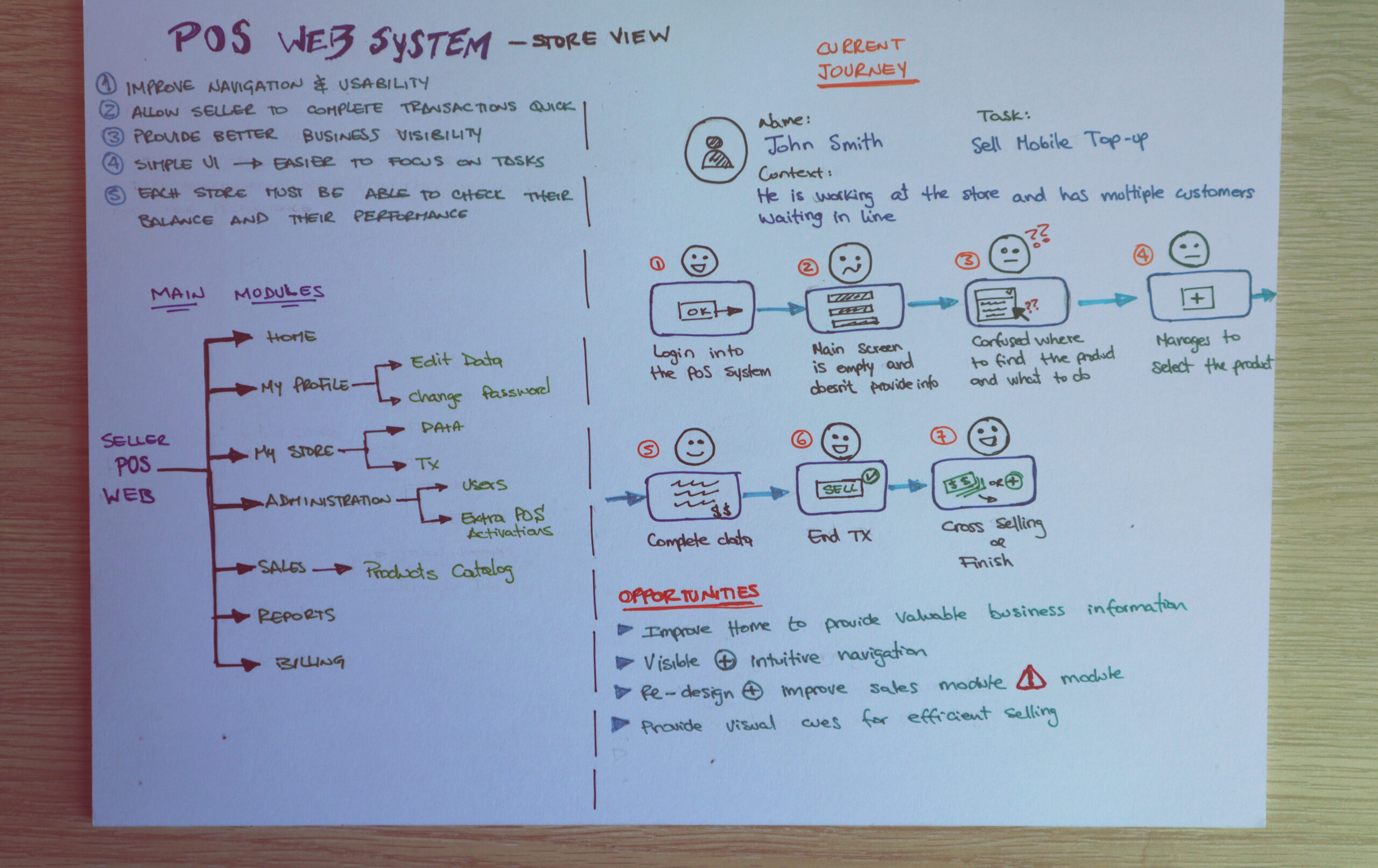
User Journeys
Pain Points
Opportunities
Brainstorming ideas based on insights
The Solution
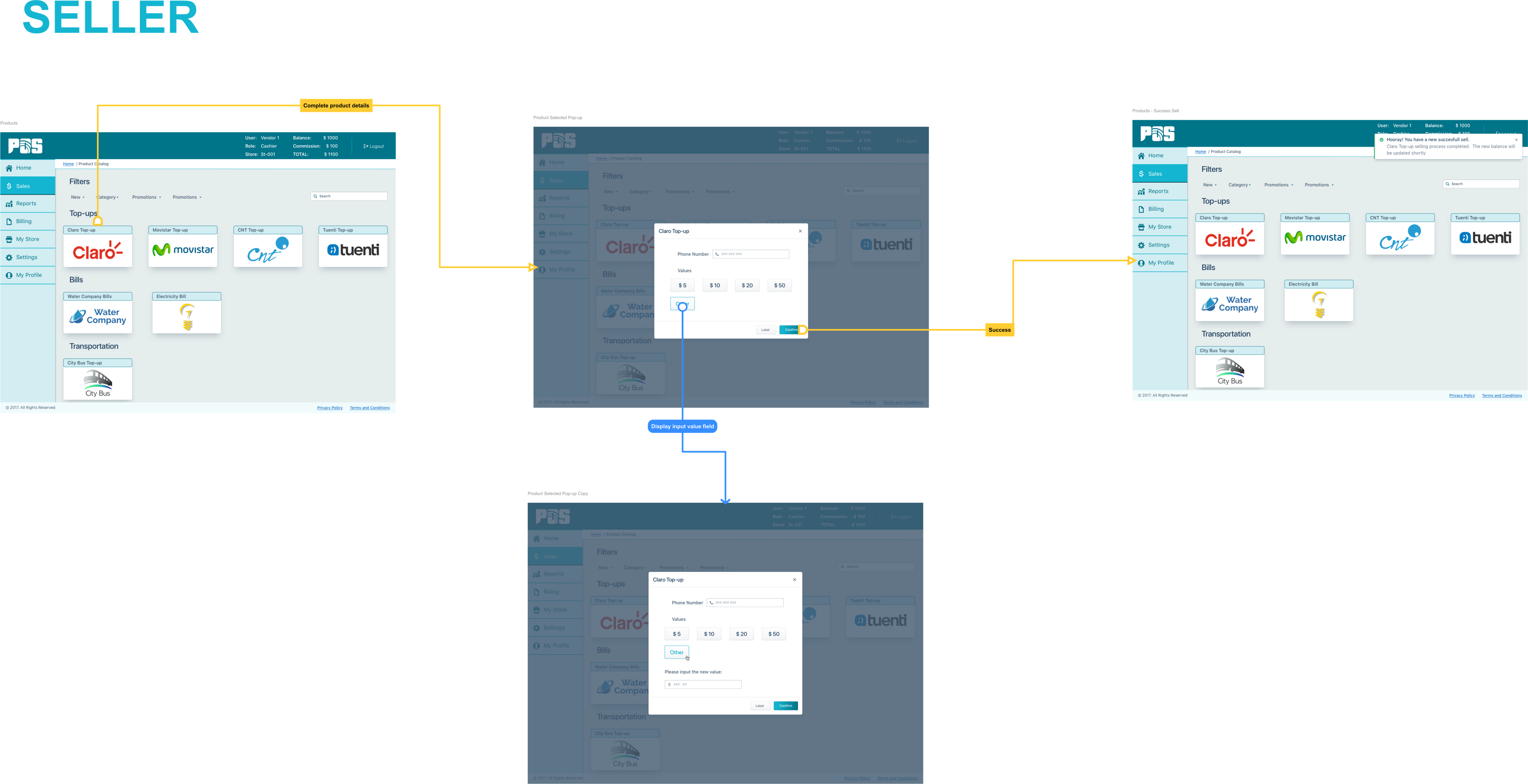
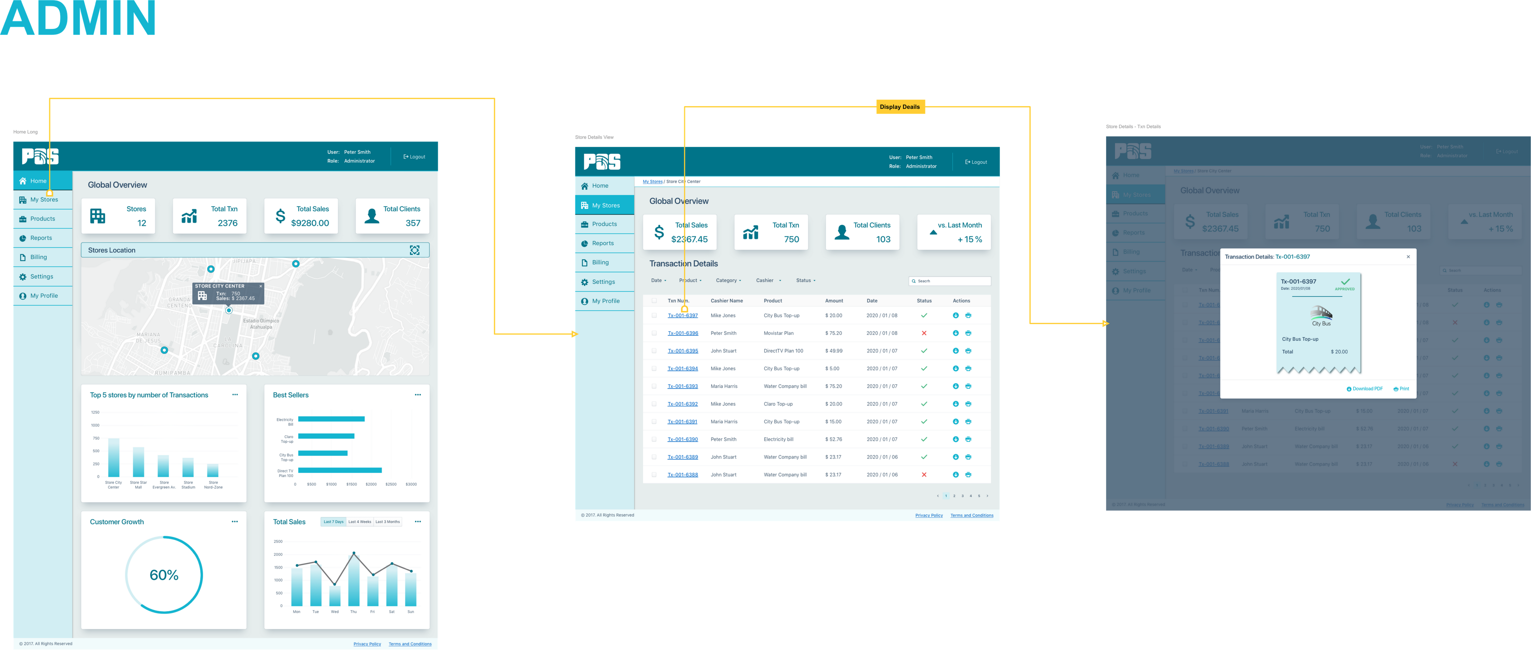
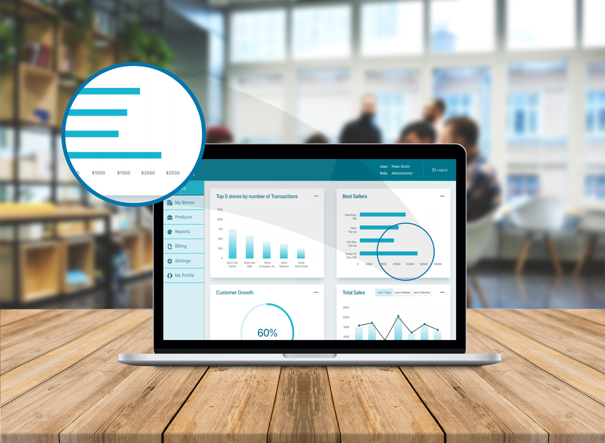
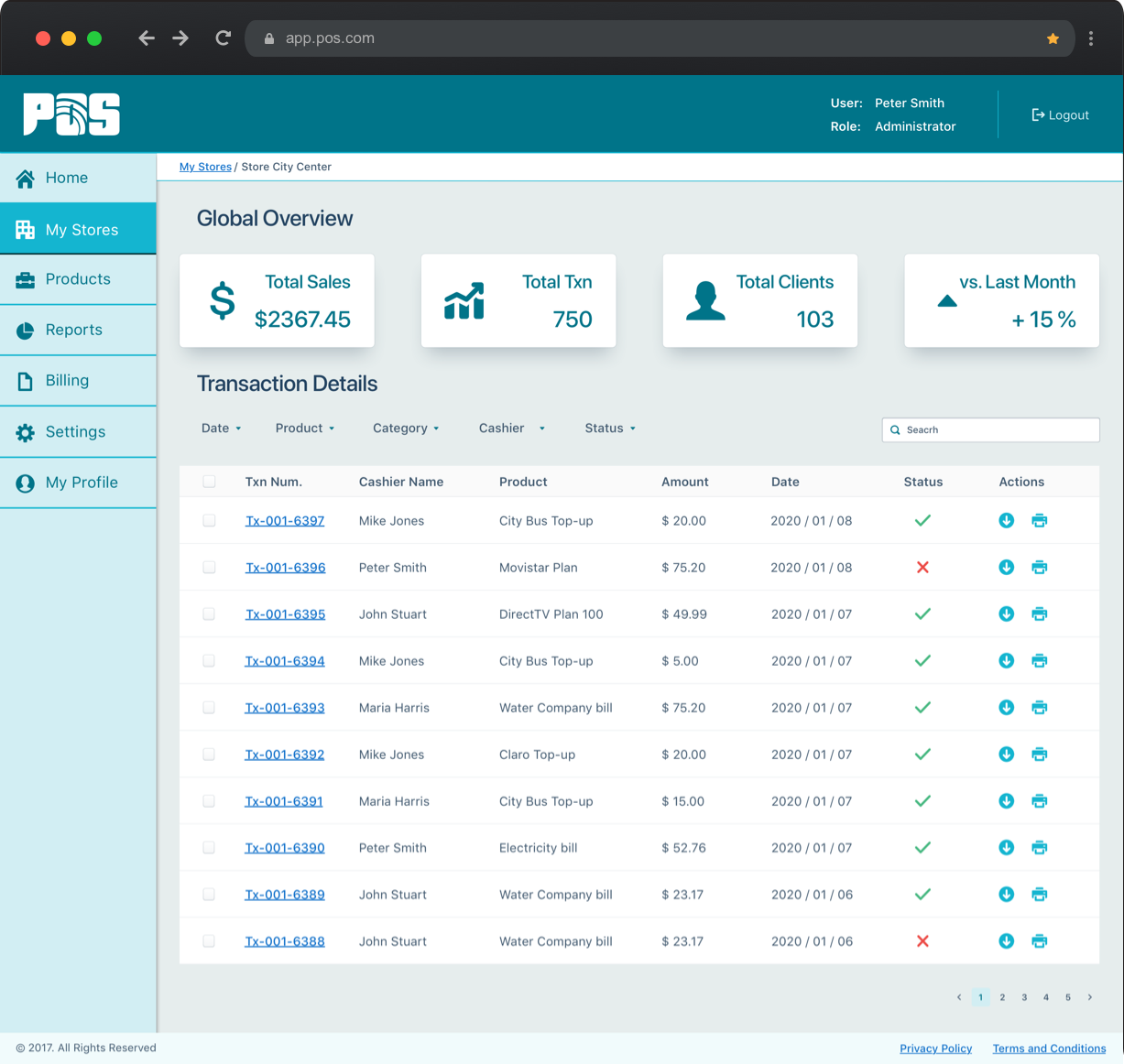
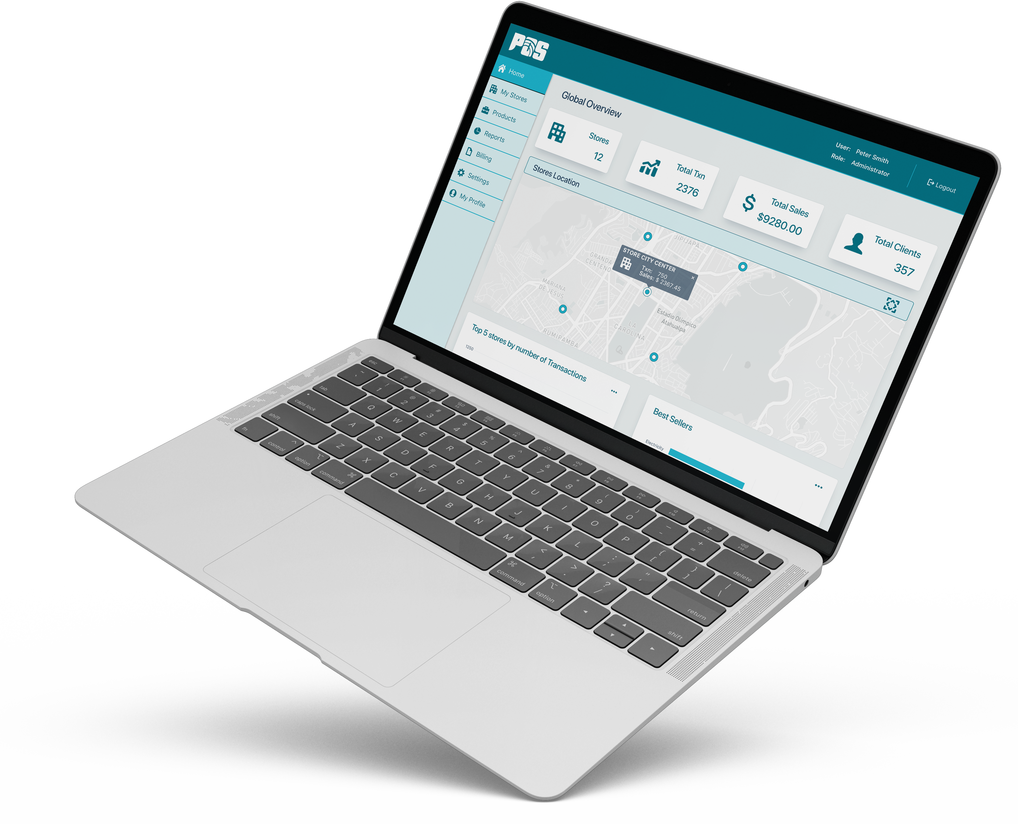
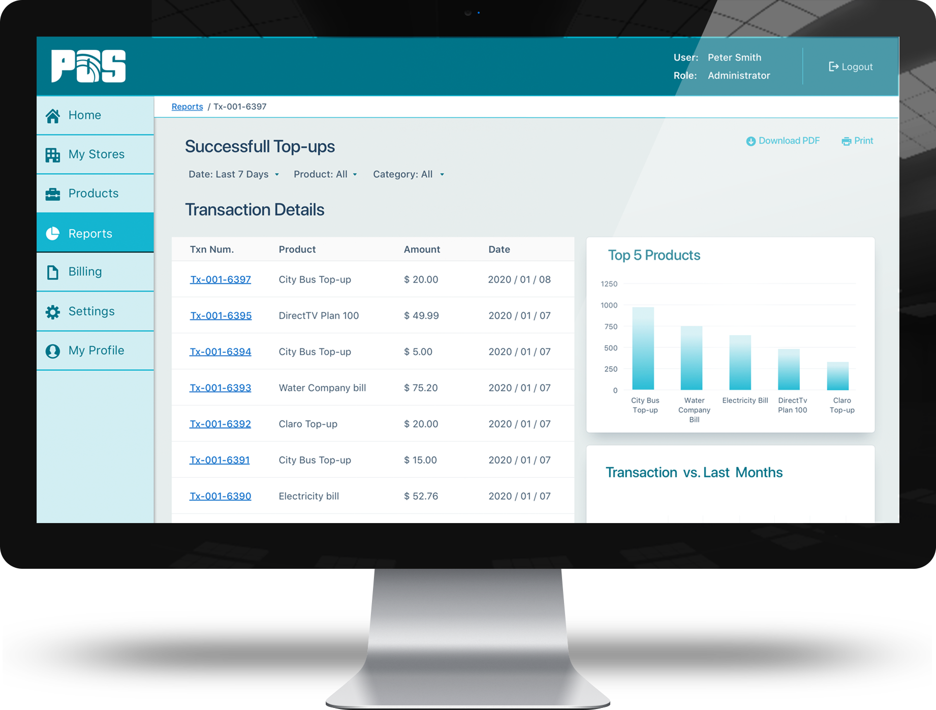
After understanding the problem, validating our hypothesis, and testing our initial prototypes, the final solution addressed the main aspects to ensure that people can access the right information at the right time. Increasing business visibility and at the same time improving the user experience.
- Perform a complete revamp of the web app structure including the navigation and main modules
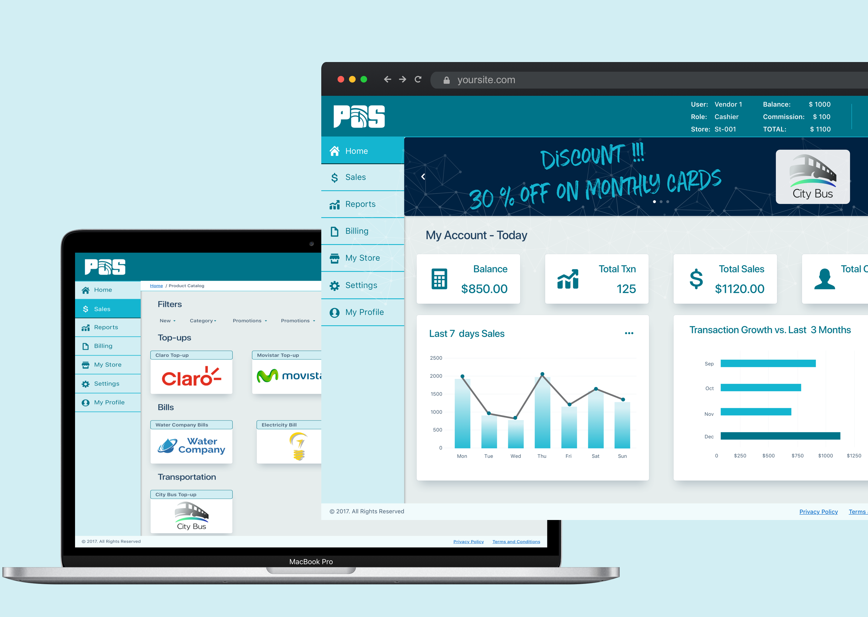
- Reduce steps to allow sellers to complete the transactions quickly.
- Improve the interaction between modules making it easier to focus on tasks.
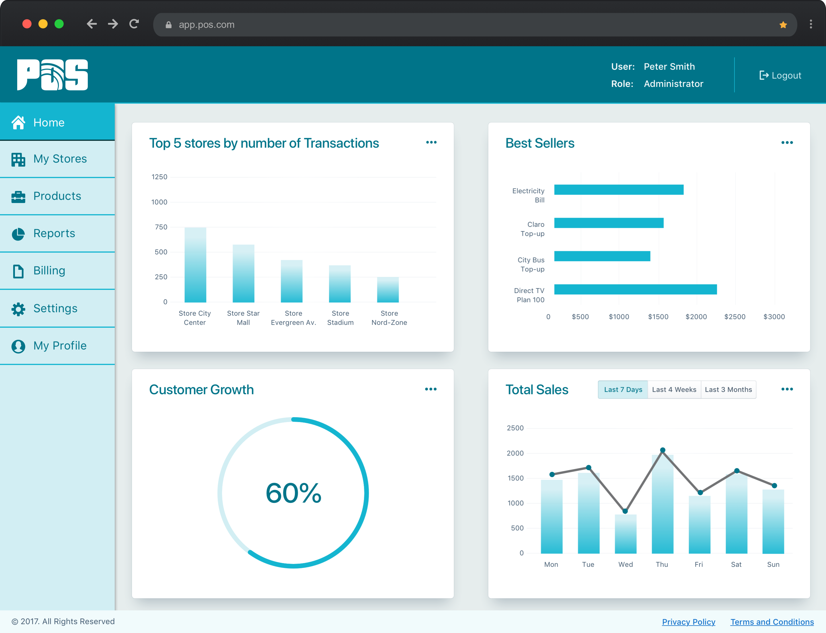
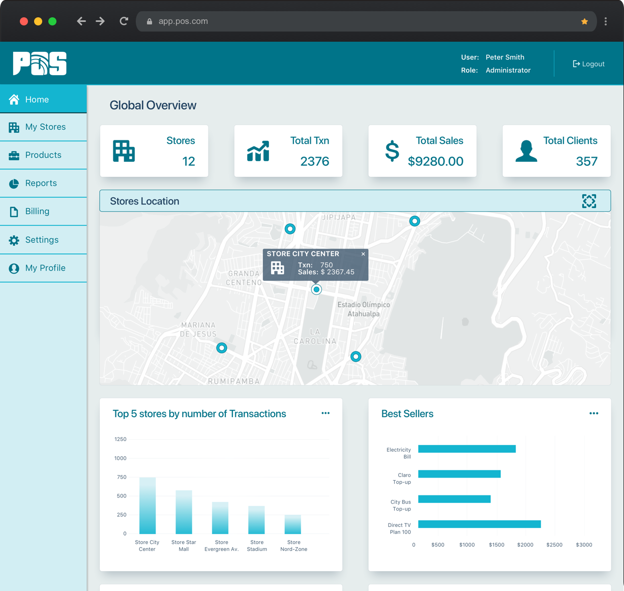
- Provide graphic elements complementing the numerical information displayed allowing visualization of business insights and comparisons.
- Allow business owners to make informed decisions by having a global overview of all operations.

My role in the project
UX Designer and Design Team Lead
Design Strategy
Define the design strategy and support ideation sessions.

User Research
Conduct interviews with users to gather qualitative information
UI Design
Create the look and feel of the solution and generate visual specs

UX and Interaction Design
Define the user flows and navigation between modules. Create interactive prototypes with finalized UI design

Usability Testing
Conduct usability testing sessions
Gather feedback from the users

